Wednesday, January 1, 2014

File > New Year


Today, this first day of 2014, I decided to do something I've been meaning to do for quite a while - create some hand crafted art for the hell of it. That's what the image above is.

Most applications from Photoshop to Word start a new document by going to the "File" menu and choosing "New". I found it oddly refreshing to take that concept offline and cut letters out with an X-acto knife. Here's to all the new beginnings and blank documents this year will open for each of us. 

It's hard to believe 2013 already came and went. Here's a recap of all the eLearning related milestones I reached last year:
  • Attended my first DevLearn conference
  • Started a local eLearning meet-up for the Columbus, OH area
  • An article I wrote was featured in ASTD's T+D magazine
  • Presented at an internal company conference on PowerPoint prototyping

Despite my full time job, a steady stream of freelance projects, and family responsibilities, I somehow also managed to publish 9 writings in the past year. 

Thursday, November 7, 2013

How to Easily Transcribe Audio and Video by Hand

It’s nice to see more online video services like Panopto, automatically transcribe video and make them searchable. Nice, but usually pricey and locked down as a proprietary service. 

For the rest of us on a budget, developing audio and video based training with closed caption style transcription requires a typed text transcript. However many times, I’ve used audio or video for a course with no pre-typed script. 

This meant I had to simultaneously listen to a media file and frantically type out whatever was spoken. I could type a sentence or two down before the audio got away from me. Then I’d have to stop, go back a few seconds, and listen again. I’d repeat this over and over again, seldom rewinding to exactly where I needed to replay. 

The whole process took an annoyingly long amount of time. Eventually I figured out a simple technique: Slow down playback to a comfortable typing speed.

First off, download VLC for video playback. It’s a free, open source tool that will save you the headache of opening video and audio files in different slower loading players like Windows Media Player or QuickTime only to get error messages about unsupported codecs or file formats.

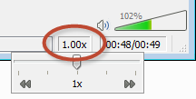
One of the capabilities of the VLC player is controlling the playback speed right from the main window. Adjust that down to somewhere between 0.25x and 0.5x speed depending on your typing abilities and how fast the speaking occurs.

You’ve now entered what I affectionately refer to as “drunken narration” mode (You’ll understand why during playback. This is particularly fun if it’s a video is of a co-worker or high ranking executive. J). This reduced speed lets you type at a comfortable pace without having to continuously stop and start the video to listen again to short bursts.

After I type out a video’s transcript with this method, I replay at 1x speed and double check my text for accuracy.

Bonus Tip: If you like to listen to Podcasts, TED videos, etc., try downloading a file of the media and playing it back with VLC at a faster speed (1.25x or 1.5x, or even 2.0x). You’ll save time, and get up to speed on your podcast library much quicker. I've noticed beta versions of YouTube and Lynda.com HTML5 players also currently allow speed changes.

Sunday, October 27, 2013

DevLearn 2013: I went, I sat, I learned.

This year's DevLearn was my first, and it was awesome. I had the chance to meet so many great people, and sit through some amazing sessions. I walked away with a few solutions to implement, and some great challenges to mull over. Here are some highlights from my perspective.

Jeremy Gutsche gave an energetic opening keynote on "Unlocking Cool" that happened to hit some key themes that appeared throughout the following sessions I attended. First he posed a question to all of us...

Why Should I choose you?
Meaning, why should our customers choose us (ideally answered in 7 words or less)? I found it a bit odd from the perspective of our industry's “customers” since the learner, student, user, eLearner, etc. (whatever we choose to call those who consume our content) often has no real choice. After deciding to work for a company, the average employee doesn't have the luxury of choice when they are assigned mandatory training from a single LMS. So instead of, “Why should I choice you?” the questions are more often “How long will this take?” and “Didn't I just do this last year?” This led right into one of Jeremy's next points.

Success leads to complacency
Despite all the talk of innovation today, there is no incentive to adapt to change when we think we already know the answer. After our industry perfected the course assignment, completion, and tracking model (via SCORM, the LMS, and rapid authoring tools), we gained the illusion of success. What little tracking SCORM allows for provided metrics to justify our actions rather than evaluating the actual impact.

But behind our metrics is a false security. What does it really mean to complete a training item with a score of 80% or higher in an LMS? As Neil Lasher asked in his session "How to Deliver Measurable Behavioral Change Using Technology," do you want your airplane pilot or surgeon to have passed an eLearning course with an 88%? What question did they miss? The part about landing the plan?! The part about not leaving surgical equipment inside the patient?!

In the panelist session "Is eLearning Broken?" (spoiler: yes), Judy Katz served questions about this innovation stifling complacency to Reuben Tozman, Micheal Allen, Julie Dirksen, and Clark Quinn. Some proposed solutions centered around asking what value we actually offer to the world as we come to terms with no longer being containers and distributors of knowledge.

Coming from a web design background, I found Chad Udell’s session on content strategy hitting the nail right on the head on the issue of complacency. Web designers and developers realized a full decade ago that the separation of content from presentation was crucial to the advancement of the web, yet it’s still a ground breaking concept to the eLearning world.

So what's the solution to all this? Perhaps a big part of the answer lies in another idea Jeremy presented...

Customer Obsession
One of Jeremy’s final talking points was around gaining an obsession for our customer. This theme came up again and again in following sessions.

At the panel previously mentioned, Julie Dirksen asked, “Who here watches their people use their product?” No hands were raised. Jeremy’s suggestion: Talk to your customer (with genuine interest!). If we are truly concerned with the impact of our work, we should engage in some level of user testing and observe our product is actually used.

In another session, Allison Anderson explained how Intel's "Learner's Manifesto" seeks to motivate employees and drive them to learn while respecting their time, and intelligence.

Along those same lines Chad Udell and Clark Quin busted smashed common myths about learning styles and generational differences to keep misinformation from hampering our instructional efforts.

Nancy Proctor explained how the Smithsonian enhanced the museum experience (both in-person and virtually) through mobile technology to become a sort of offline Wikipedia. But, their success stemmed from a mindset that looks past the technology itself, and embrace what's available to tell stories and produce relevant experiences for people.

In his session, Karl Kapp proposed the concept of game design to rethink how we approach creating eLearning. Techniques such as arouse curiosity, enhance mystery, and put the user at risk may seem counter-intuitive to traditional instructional methods, but these kinds of game concepts actually involve the user in their own learning experience.

These are just some highlights of the vast amount of information and experiences I took away from DevLearn 2013. DemoFest was amazing, the ExpoHall also had some interesting presentations on stage, and I also caught the end of a live learn chat (#lrnchat). However by far the biggest highlight of my first DevLearn was meeting so many amazing and knowledgeable people in my industry, many of whom I had only previously read their blogs, books, and tweets.

I'm definitely looking forward to attending another DevLearn in the future. See you there!

And if by chance you're in the Columbus, OH area (or know a learning professional who is), we have a local meetup. Come join us!

Wednesday, March 13, 2013

Legacy Systems

I love the podcast Accidental Creative. It’s a great quick audio inspiration for creative professionals looking to produce good work without getting burned out.

The latest podcast covers legacy systems, and how to keep them from inhibiting our work. A few take-a-ways:
  • At regular intervals, step back and examine how you're doing your work. 
  • Examine if your priorities are still the same, or if they have shifted.
  • Do you need to approach work differently to stay effective?
  • Changing tools can help, but don’t assume it’s an end-all solution.
In many ways the podcast’s portrayal of legacy systems reflects the traditional eLearning course and LMS relationship. At what point do we take a step back and reexamine if what we’re doing is truly effective? Are we just throwing good money after bad?

This was a timely topic for me. I’m becoming increasingly frustrated with the tools available for creating eLearning content. Often, I find myself developing hand-coded solutions that work in spite of the tool rather than in tandem.

The landscape of web technology is changing faster than tool vendors can release products and patches. I often wonder why I’m even using certain tools in the first place, and if I should just hand-code my own solutions entirely.

So for me, taking a step back means reflecting on whether it’s finally time to give my hand-coding skills some much needed attention and work to someday ditch such expensive legacy systems entirely.

Wednesday, January 30, 2013

The Ghost of eLearning Future

During my 5+ years as an eLearning developer, I've continually wondered what our industry would look like if we didn't become entrenched in decade(s) old bad habits. What if we could truly embrace advances in web design and development, and not insist on CD-Rom era course structures and flashy... Flash?

Sure, we'll probably always be a bit behind the times, but glossaries? Tables of contents? Locked linear navigation? These kinds of book navigation metaphors were all hold overs from an era before the Internet went mainstream and people became comfortable with web technology (like scroll bars). The familiar concept of a book was a mental anchor secured in reality while one trekked into the scary unknown technology realm of the early 1990's. To me, this is as outdated a navigation structure as AOL keywords, so to still be using it so heavily in 2013 is beyond absurd. Yet it's unchecked prevalence is overwhelming.

Then, just when I had almost forgotten what it was like to be inspired as an eLearning developer, I came across Snowfall, a New York Times multimedia feature experiment. If you haven't, I highly recommend taking a few minutes to truly delve into it's splendor.

Each time I view compelling web content like this, it's like a visitation from the Ghost of eLearning Future to warn of all the cool stuff we'll miss out on if we continue our same tired old habits of eLearning past. I'm far from the first to say so, but nothing ever seems to truly shake things up.

Here are my main take-a-ways from the Snowfall piece:

This is what real HTML5 looks like.
Forget the marketing hype (or flat out lies) many vendors proclaim about tools publishing to HTML5. THIS is what HTML5 (and related web technologies) can do. We should expect nothing less for eLearning. To be fair, vendors are breaking new ground with HTML5 publishing options, so they need some time to work out the kinks. However, to only focus on replacing PowerPoint to Flash conversion with PowerPoint to HTML5 conversion completely misses the point in my opinion. Ditch the slides. Embrace the scroll.

This is the future of consuming content online.
Compelling storytelling. Well thought-out visual design. Multimedia content that reinforces text. Responsive page layouts and content (adapting to a whatever device screen viewed on). All of these work beautifully together, as they should. This is the future of web content, and it's wonderful. Let's get on board before we're left at the station.

This is what eLearning could and should be!
I'm willing to accept that as an industry, eLearning development will always lag behind cutting edge technology trends and even take a while to adopt established best practices. However, I'm not comfortable repeating the same past mistakes. In my opinion, we should push to make this new kind of content delivery a reality.

Friday, January 11, 2013

Unconventional eLearning Simulation

Last year during the Articulate Storyline beta, I created an unconventional "eLearning" simulation.

Since I typically spend work days creating conventional corporate training courses (sales training at the time), I wanted to try something completely different and also experiment with some ideas:

What if the goal of a simulation was to do tasks incorrectly? Could that actually reinforce correct behavior?
  • What if avatars were jerks and gave you bad advice?
  • What if you were yelled at and insulted instead of monotonously encouraged and congratulated? 
  • Could an eLearning authoring tool be used to tell an interactive story?
Somewhere in the recesses of my imagination, I came up with Carl's Clunkers, a sleazy car salesman simulation. 

As you'll see, the high quality images of people from eLearningArt played a strong role. All of the sources of the assets used are listed at the end.
Post a comment if you have any feedback or questions about how I made this unconventional simuation.

Saturday, January 5, 2013

Moving into 2013

2012 was a huge year for me personally. I started a new job in August, became a father (again) in September, and achieved several personal goals I set earlier in the year including running 5k.

As far as eLearning, I was involved in both the Articulate Storyline and Lectora 11 Betas, and posted several eLearning related blog posts on other sites last year (often to the neglect of this one). Here are all 13:

Musings:
Realizing the Potential of the Tin Can API

Product Reviews:
3 Defining Features of Articulate Storyline
ReviewLink: Online Review Tool for Lectora

Effective Visual Design Series:
Part 1 – Being an Advocate for Good Design
Part 2 – Solving Problems Visually
Part 3 – Choosing Colors, Fonts & Images

eLearning Development Tips:
Using White Space for Clutter-Free eLearning
Keeping eLearning Readable – Visual Readability
Call to Action Items in eLearning

Lectora Tutorials:
Extending Lectora with an iFrame
Lectora Best Practices Part 1 – Optimizing Preferences
Lectora Best Practices Part 2 - Variables and Actions
Lectora Best Practices Part 3 – Using Text

I'm looking forward to 2013. I'm planning to step up my game on several fronts when it comes to my work. So far things are going great. Hopefully you are off to a good start into 2013 as well!